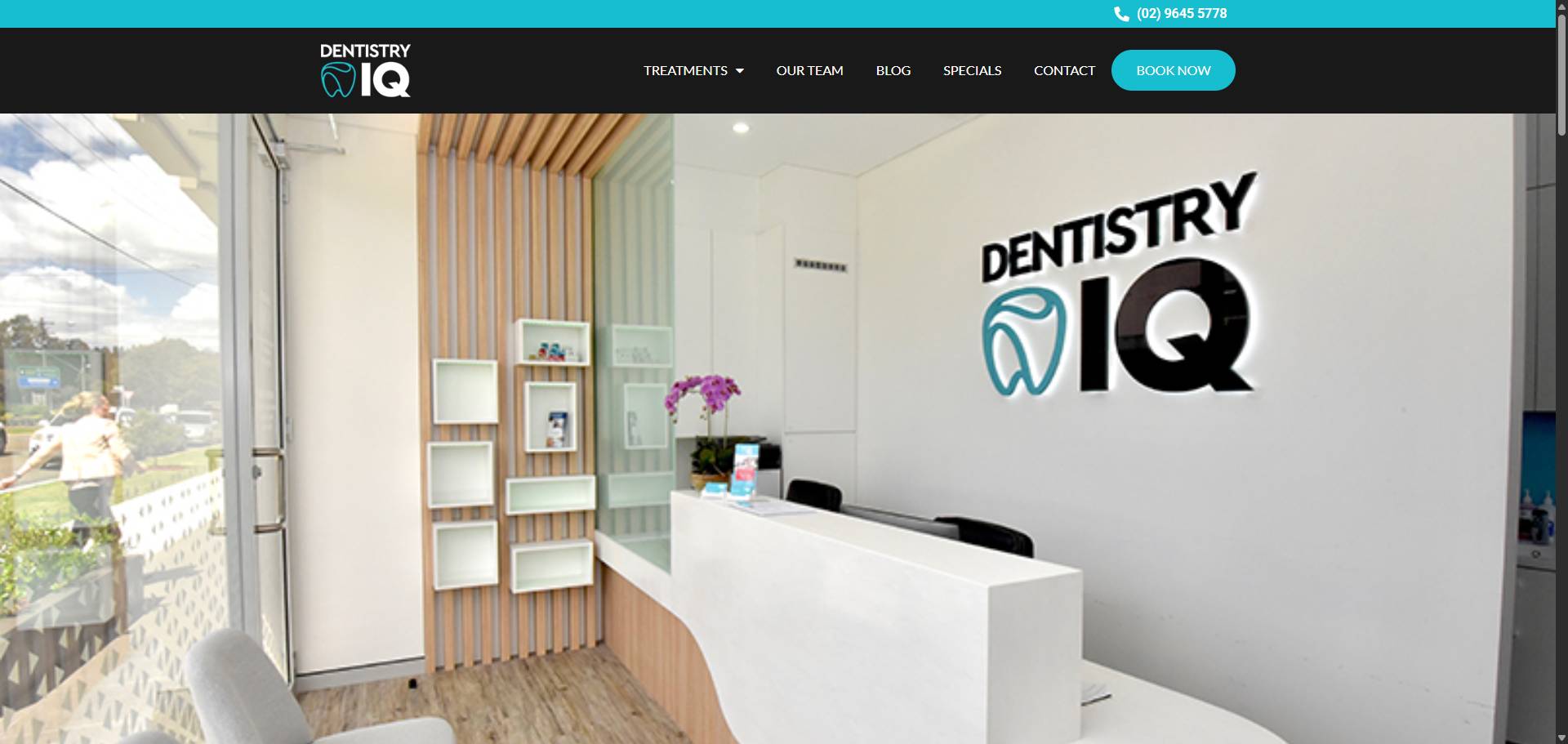
Building trust on a cardiology website depends on more than medical expertise; it requires thoughtful visual and verbal elements that resonate with patients. Clear design, genuine messaging, and user-friendly navigation all play vital roles in creating confidence. This blog breaks down key aspects—from consistent branding and colour choices to patient stories and straightforward calls-to-action—that work together to build reliability. Each section focuses on specific strategies that help visitors feel secure, understood, and respected throughout their online experience.
Establishing Credibility Through Clear and Consistent Visual Identity
Establishing credibility through a clear and consistent visual identity forms the foundation of trust on a cardiology website. A cohesive design, featuring uniform fonts, logos, and imagery styles, signals professionalism and reliability to visitors immediately. This consistency complements colour choices that evoke calmness and expertise, as discussed in the section on colour psychology. When patients see a polished visual presence aligned with authentic messaging, their confidence grows naturally. Clear branding also supports intuitive navigation by creating familiar visual cues that guide users effortlessly through the site’s layout. Integrating professional photography further humanises this identity, connecting patients emotionally while reinforcing authenticity. Together with transparent information about privacy and patient testimonials showcased elsewhere in the blog, a strong visual identity reassures visitors they have found a trustworthy source for their cardiac care needs without feeling overwhelmed or pressured.
Enhancing Patient Confidence with Authentic and Compassionate Messaging
Authentic and compassionate messaging plays a vital role in building patient confidence on a cardiology website. Clear, empathetic language reassures visitors that their concerns are understood and valued, setting a tone of genuine care. This verbal approach complements the visual identity by humanising the experience, much like professional photography does to create warmth and connection. When combined with patient testimonials and success stories, authentic messaging deepens trust by sharing real voices and outcomes. It also supports transparency efforts that demonstrate openness about procedures and privacy standards. Thoughtful wording paired with calm colour schemes enhances emotional comfort while consistent navigation ensures patients feel guided rather than overwhelmed. Together, these elements form an inviting environment where patients feel safe to engage actively without pressure, reinforcing confidence from first visit through ongoing care relationships.
Utilising Colour Psychology to Reinforce Calmness and Professionalism
Colour choices shape how patients feel when they visit a cardiology website. Soft blues and muted greens evoke calmness, easing anxiety often tied to heart health concerns. These hues signal reliability and professionalism without overwhelming the visitor, reinforcing trust from the first glance. When combined with a clear and consistent visual identity, as discussed in the section on establishing credibility, colour becomes a silent but powerful communicator of care and expertise. Gentle contrasts guide the eye smoothly through content, supporting optimised navigation that reduces frustration for users of all ages. Thoughtful colour use also complements authentic messaging by creating an inviting atmosphere where compassion feels genuine rather than staged. By aligning colours with patient testimonials or professional photography, the site’s tone remains balanced—calm yet confident—helping visitors connect emotionally while recognising clinical competence. This subtle psychological approach strengthens long-term trust more effectively than words alone can achieve.
Incorporating Patient Testimonials and Success Stories to Strengthen Trustworthiness
Patient testimonials and success stories anchor the emotional connection that builds trust on a cardiology website. Sharing real experiences highlights the genuine impact of care, offering reassurance beyond clinical facts. These narratives humanise the practice in ways that professional photography alone cannot, complementing visual elements that establish credibility and compassion. When paired with clear, authentic messaging, patient voices reinforce confidence by showing outcomes in relatable terms. Including diverse stories also supports accessibility by reflecting varied backgrounds, which ties into thoughtful navigation and layout designed for ease of use. Transparent presentation of testimonials demonstrates openness while respecting privacy standards outlined elsewhere on the site. This approach balances encouragement with subtlety, aligning perfectly with well-crafted calls-to-action that invite engagement without pressure. Together, these elements create a layered sense of reliability and warmth crucial for patients seeking specialised cardiac care online.
Optimising Navigation and Layout to Foster Ease and Accessibility for All Users
Navigation and layout shape how visitors interact with a cardiology website, making ease and accessibility essential for building trust. A clear menu structure, intuitive page flow, and readable fonts reduce frustration and empower users to find crucial information quickly. This seamless experience complements consistent visual identity elements by reinforcing professionalism at every click. Thoughtful design choices support colour psychology principles that soothe anxiety while guiding attention naturally toward important sections like patient testimonials or privacy policies. Accessibility features such as keyboard navigation or screen reader compatibility ensure inclusivity, signalling respect for all patients’ needs. When the site feels effortless to use, it strengthens patient confidence alongside authentic messaging and humanising photography. Clear paths also highlight calls-to-action gently, encouraging engagement without pressure. Overall, optimised navigation forms the backbone of a trustworthy cardiology website by connecting each element—visual style, messaging tone and transparency—to create an inviting digital environment where patients feel valued from first visit onward.
Integrating Professional Photography to Humanise the Cardiology Experience
Integrating professional photography adds a vital human touch to the cardiology website, making clinical expertise feel approachable and real. High-quality images of staff interacting with patients or candid moments during consultations create emotional connections that words alone cannot achieve. This visual warmth complements authentic messaging, reinforcing patient confidence as discussed in the section on compassionate communication. Photography also supports credibility by showcasing a transparent and welcoming environment, aligning with consistent visual identity principles. Careful choice of images can reflect calmness through colour tones and lighting, tying into colour psychology strategies that soothe visitors. Including genuine patient interactions visually enhances testimonials and success stories, deepening trustworthiness without relying solely on text. Moreover, thoughtful placement within a clear layout ensures these photographs enhance navigation rather than distract from it. Together with transparent privacy practices and subtle calls-to-action, professional photography humanises care while encouraging engagement in a respectful way that builds lasting relationships with patients.
Crafting Clear Calls-to-Action That Encourage Patient Engagement Without Pressure
Calls-to-action must invite patients to engage without feeling pressured or overwhelmed. Clear, gentle prompts encourage visitors to take small but meaningful steps, such as booking a consultation or accessing educational resources. Using straightforward language avoids confusion and builds confidence, linking well with authentic messaging that conveys compassion rather than urgency. Subtle visual cues tied to the site’s colour psychology—calm blues and muted tones—can make CTAs feel inviting rather than demanding. This approach complements a consistent visual identity by maintaining harmony across all elements. Including patient testimonials nearby can reassure users that others found value in taking action, reinforcing trustworthiness without pushiness. Thoughtful placement within an optimised layout ensures calls-to-action remain accessible and easy to find for all users, supporting smoother navigation throughout the site. Ultimately, clear CTAs balance encouragement with respect for patient autonomy, strengthening engagement while honouring privacy and transparency principles central to long-term trust building.
Maintaining Transparency and Privacy to Build Long-Term Patient Trust
Transparency and privacy form the foundation of lasting relationships between patients and cardiology providers. When patients see their information respected and communication open, trust deepens beyond initial impressions created by design and messaging. This respect complements clear visuals, compassionate language, and thoughtful site structure, making every interaction feel safe and genuine. Together, these elements create an experience where patients feel valued and understood. At Pracxcel, we recognise the importance of this balance and support efforts to build trust that endures through honesty and care.


