Why Colour Choices Matter in Healthcare Web Design
When a patient lands on your website, colour shapes their first reaction before they read a single word. In healthcare, that first reaction matters. Patients look for safety, clarity, and trust. Your colour choices can either support that feeling or weaken it.
A healthcare website needs to feel calm and clear. Strong colours may suit retail brands, but medical websites serve a different purpose. You guide patients who may feel anxious, unwell, or unsure. Colour helps you set the tone, guide attention, and support easy reading.
In Australia, healthcare websites also need to support accessibility and inclusivity. Colour combinations affect how easily patients read content, book appointments, and trust your clinic. When colour works well, it improves engagement and supports patient action without distraction.
The Psychology of Colour in Healthcare Settings
How Patients Emotionally Respond to Colour
Patients react to colour in predictable ways. Soft and balanced colours help people feel at ease. Harsh colours can raise stress levels or cause confusion.
Cool colours often reduce visual strain. Warm tones can feel friendly when used with restraint. High contrast helps patients scan information quickly. Poor contrast makes reading harder, especially for older users.
When you choose colours with care, you support calm decision-making. This matters when patients look for services, fees, or appointment details.
Cultural and Regional Colour Perceptions in Australia
Australian healthcare websites usually favour neutral and soft palettes. Patients expect a clean and professional look. Bright or loud colours often feel out of place in medical settings.
White space also plays a role. Australian users respond well to clear layouts with breathing room. Colour should support structure rather than fill space without purpose.
Colour Associations Common in Healthcare
Some colours appear often in healthcare for good reason:
- Blue suggests trust and stability
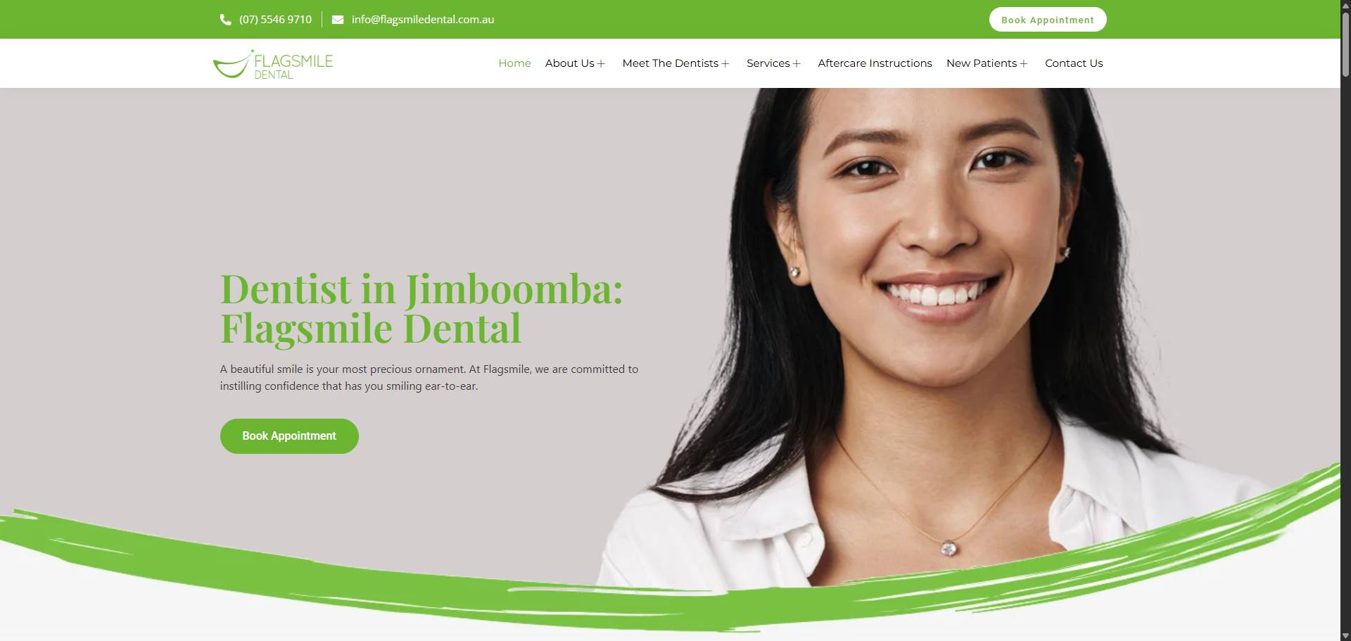
- Green suggests health and balance
- White suggests cleanliness
- Grey suggests structure and calm
These colours work best when balanced. Overuse of any single colour can reduce clarity.
Core Colour Principles for Healthcare Websites
Clarity and Readability
Text must remain easy to read on every page. Dark text on light backgrounds usually works best. Headings should stand out without feeling heavy.
Buttons need enough contrast so patients can spot them quickly. Links should look like links. Colour should never confuse function.
Accessibility and WCAG Compliance
Accessibility is not optional for healthcare websites. Colour contrast affects patients with low vision or colour blindness.
You should avoid colour-only signals. For example, do not rely on red text alone to show errors. Use icons, labels, or text support.
Good contrast also helps mobile users in bright conditions.
Consistency Across Pages and Devices
Your website should use the same colour system on every page. This helps patients learn how to use your site faster.
Consistency builds confidence. It also supports brand recognition across devices, booking systems, and patient portals.
Best Primary Colours for Healthcare Websites
Blue-Based Colour Schemes
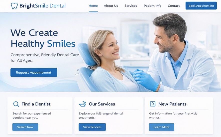
Blue works well for most healthcare clinics. It feels stable and professional. Many GP clinics, specialists, and hospitals use blue as a primary colour.
Soft blues work better than deep navy for large background areas. Darker blues suit headings or navigation bars.
Green-Based Colour Schemes
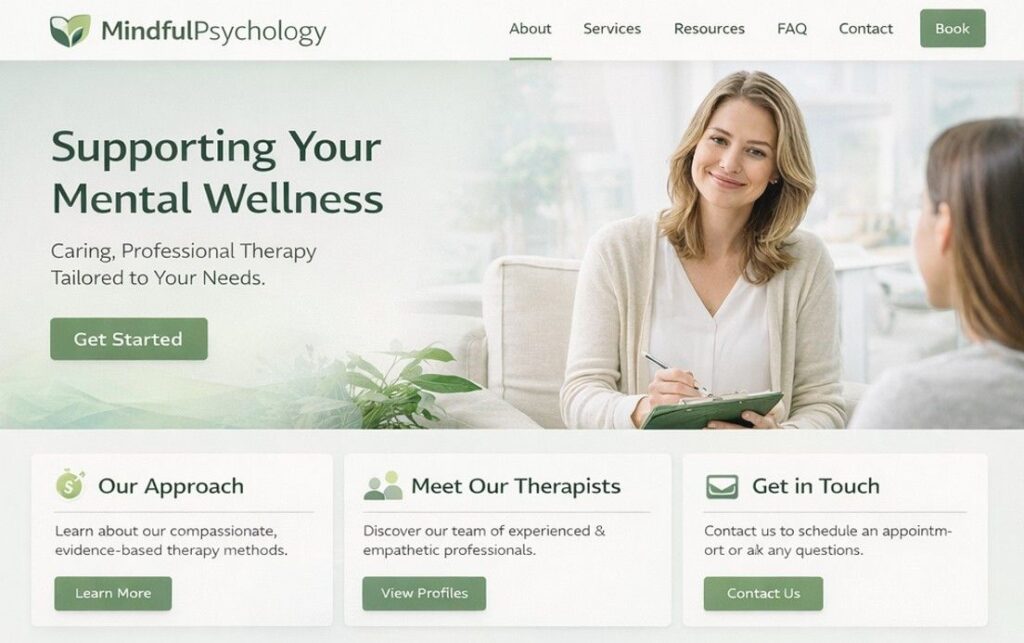
Green works well for clinics that focus on recovery or wellness. Physiotherapy, allied health, and holistic services often use green.
Muted greens feel calm and supportive. Bright green should stay limited to accents or icons.
Neutral and White-Dominant Schemes

White-based designs feel clean and modern. They support clear reading and strong layout structure.
Neutral greys help separate sections without visual noise. These schemes suit clinics that share educational content or long service pages.
Effective Secondary and Accent Colour Choices
Accent Colours for Calls to Action
Accent colours help guide action. Booking buttons, contact forms, and phone links need to stand out.
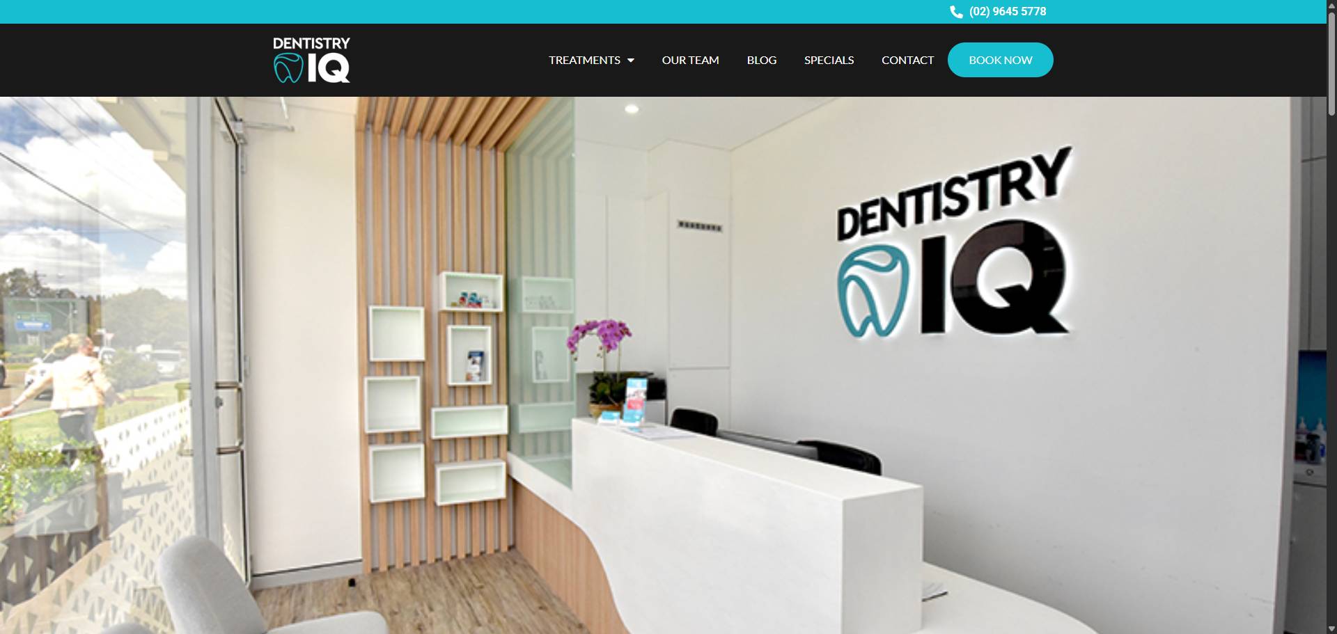
Soft teal, muted orange, or darker green often work well. Avoid using red for booking actions, as it can signal warning rather than progress.
Colours That Improve Navigation and Scanning
Navigation menus benefit from subtle contrast. Patients should see where they are without effort.
Icons, bullet points, and section dividers should use consistent accent colours. This helps scanning and reduces cognitive load.
How to Avoid Overuse of Accent Colours
Accent colours lose impact when overused. Limit them to key actions and highlights.
If everything stands out, nothing stands out. A calm base with focused highlights works best.
Recommended Colour Combinations for Healthcare Websites
Blue and White with Soft Grey Accents
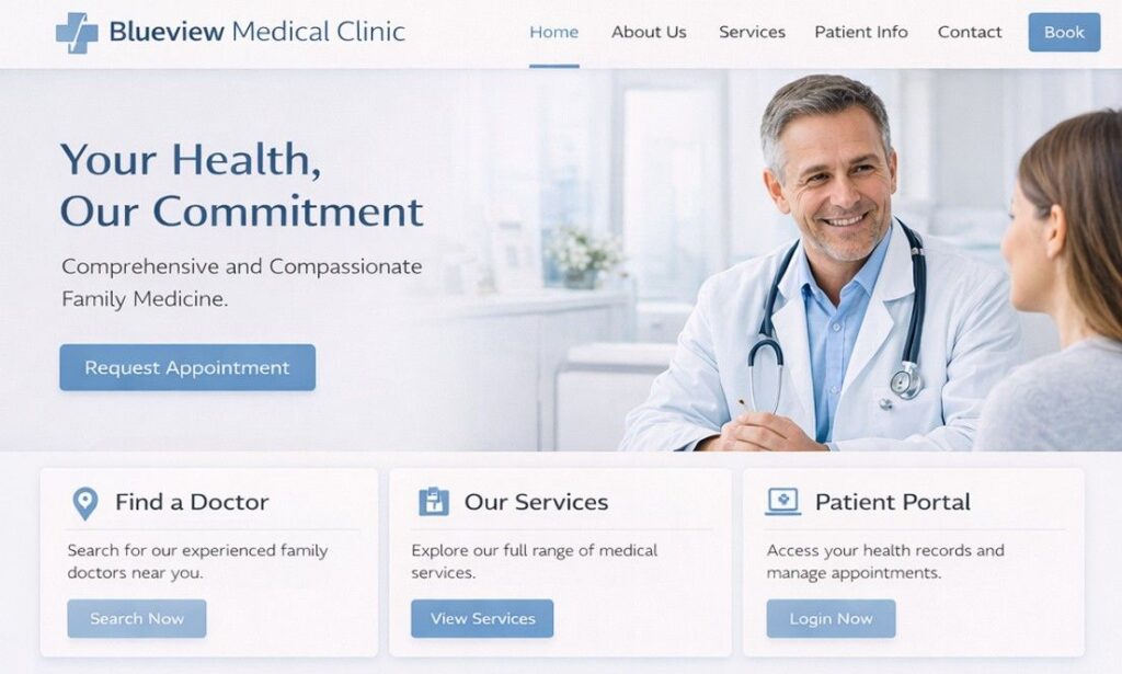
This combination feels safe and familiar. It suits GP clinics and specialists.
White supports clarity. Blue builds trust. Grey adds structure without distraction.
Green and Neutral Beige or Grey
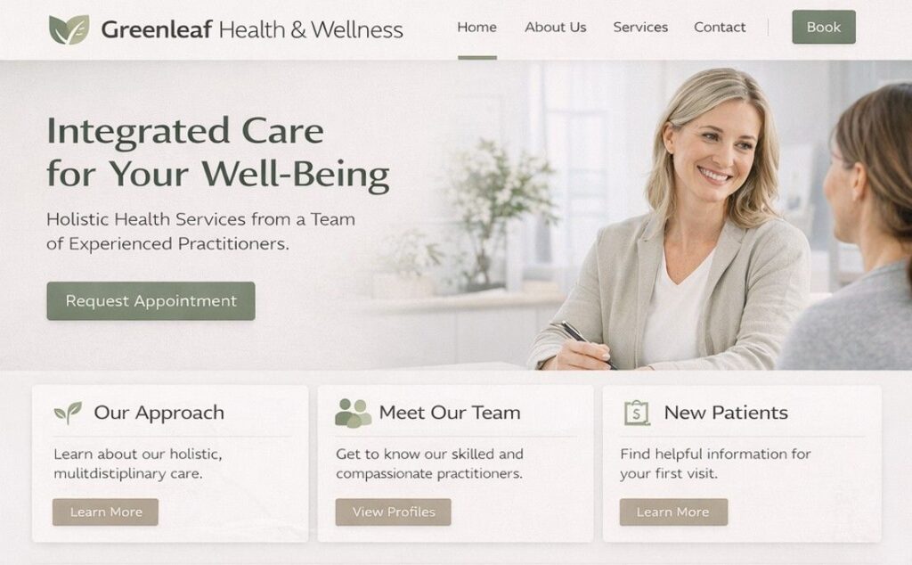
This palette feels warm and welcoming. It works well for allied health clinics.
Beige softens the look. Grey supports readability. Green anchors the health message.
Navy, White, and Muted Teal

This combination suits specialist clinics. Navy adds authority. Teal adds balance.
Use navy sparingly to avoid heavy visuals.
Soft Pastels with Strong Contrast Text
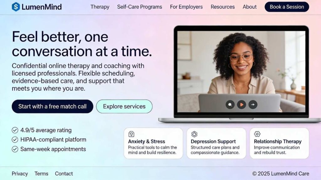
Mental health and paediatric clinics often use pastel tones. Soft colours reduce stress.
Text contrast remains critical. Pastels must support readability at all times.
Colour Combinations by Healthcare Practice Type
GP and Family Medical Clinics
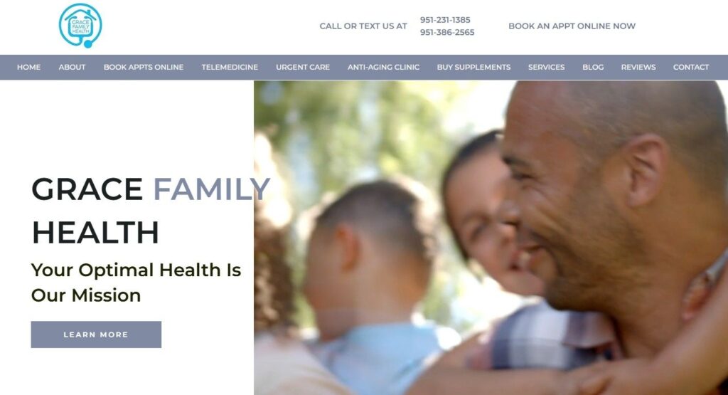
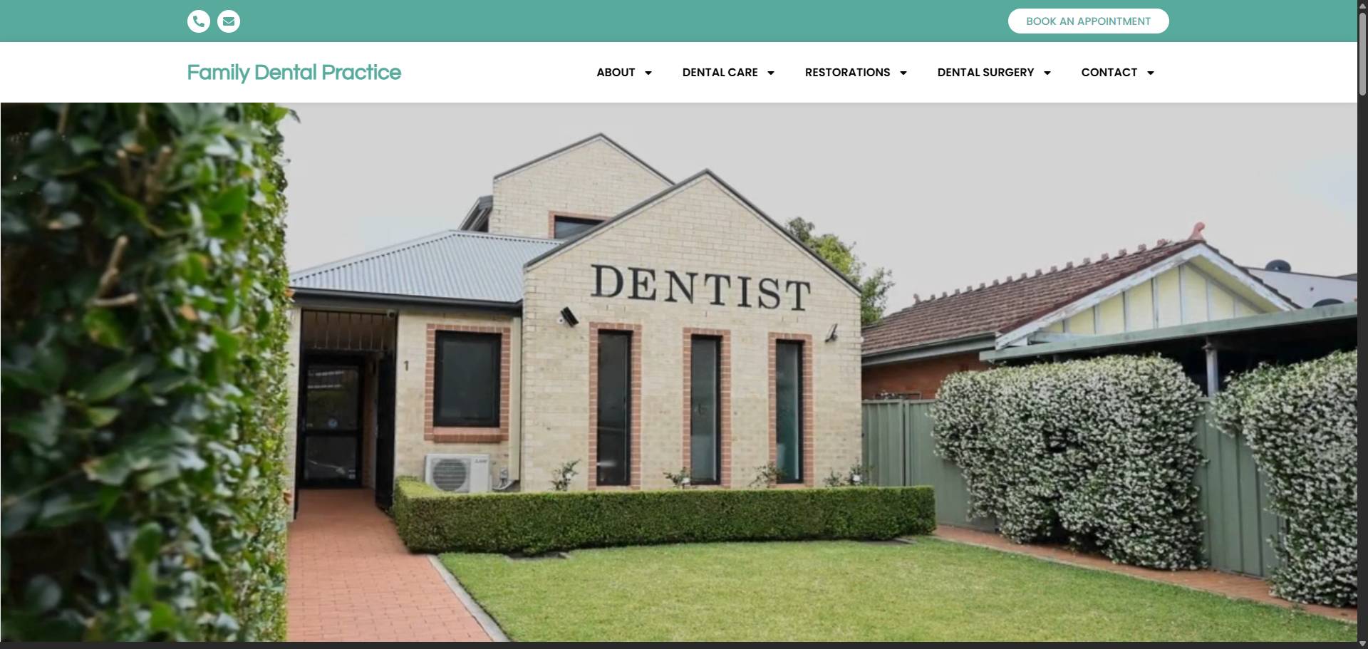
GP websites need neutral and inclusive colours. Blue, white, and grey work well.
Avoid extreme contrast or bold accents. The goal is calm reassurance.
Specialist and Surgical Clinics

Specialist clinics benefit from structured palettes. Navy, grey, and white feel professional.
Accent colours should remain subtle and limited.
Allied Health and Physiotherapy Clinics
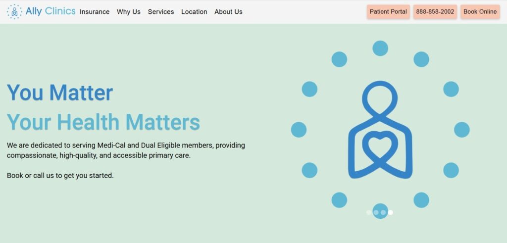
These clinics can use warmer tones. Green and soft blue suggest movement and recovery.
Colour can support energy without causing distraction.
Dental Clinics

Dental websites should reduce anxiety. Clean whites with soft blue or green help achieve this.
Avoid strong reds or sharp contrasts.
Mental Health and Psychology Clinics

Low contrast and soft colours suit mental health websites. Avoid bright colours.
Colour should feel steady and supportive.
Colours to Avoid on Healthcare Websites
Overuse of Red and Bright Orange
Red signals urgency or danger. In healthcare websites, this often causes stress.
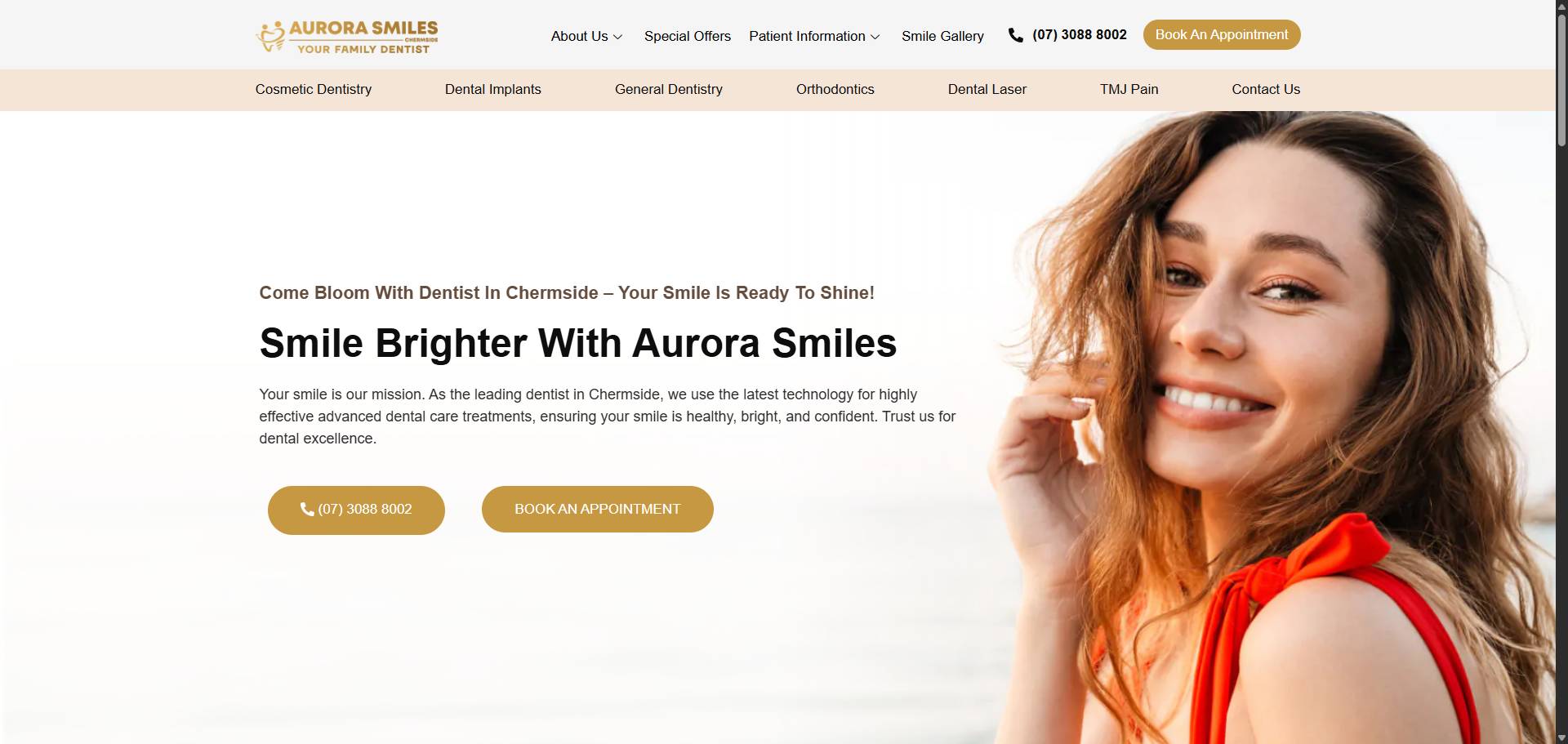
Orange can work in small doses but feels aggressive when overused.
High-Saturation or Neon Colours
Neon colours reduce trust. They also harm accessibility.
These colours suit promotions, not healthcare services.
Low-Contrast Colour Pairings
Light grey text on white backgrounds causes strain. Poor contrast leads to higher bounce rates.
Always test readability across devices.
SEO, UX, and Conversion Impact of Colour Choices
How Colour Affects Bounce Rate and Dwell Time
Patients stay longer on sites that feel comfortable. Calm colour schemes support reading and scanning.
Visual stress increases exits. Clear design supports engagement.
Colour and Conversion Optimisation
Booking buttons need visibility. Colour supports clear action paths.
Good colour use supports form completion and phone clicks.
Colour Consistency and Brand Recognition
Consistent colour builds memory. Patients recognise your brand across visits.
This supports trust and return visits.
Best Practices for Implementing Colour Systems on Healthcare Websites
Build a Defined Colour Palette
Every healthcare website should have a defined palette. This includes primary, secondary, and accent colours.
Clear rules reduce design errors.
Test Colour Accessibility Before Launch
Use contrast testing tools. Test on mobile and desktop.
Ask real users to review readability.
Maintain Colour Consistency Across Digital Touchpoints
Your website, booking system, and patient portal should feel connected.
Consistent colour supports ease of use.
How to Choose the Right Colour Combination for Your Clinic
Start with your patients. Consider age, services, and expectations.
Review competitor websites in your area. Avoid copying but note patterns.
Work with professionals who understand healthcare websites. A healthcare-focused web design team can help align colour, usability, and compliance. You can explore this through a dedicated healthcare web design company that understands Australian clinics and patient behaviour.
Conclusion: Colour Is a Silent Trust Builder in Healthcare Websites
Colour shapes how patients feel before they read your content. Calm and clear palettes support trust and confidence. Good colour choices also support accessibility, engagement, and bookings.
If your website feels dated or confusing, colour may be part of the issue. Thoughtful colour systems improve patient experience and support long-term growth. When colour supports clarity, patients stay longer and act with confidence.
Many Australian clinics work with teams like Pracxcel to review their website design through a healthcare lens, where colour, layout, and compliance all work together. When colour supports clarity, patients stay longer, understand your services faster, and take the next step with confidence.


