Why Font Choice Matters for Healthcare Websites
When a patient lands on your healthcare website, your font choice speaks before your words do. It sets expectations, builds trust, and affects how easily people understand your services. In healthcare, clarity matters. Patients want reassurance, not distraction.
Many clinics invest in content and design but overlook typography. Yet fonts guide how patients read, scan, and decide. A hard-to-read font increases frustration. A clean, familiar font helps patients feel safe and informed.
Font combinations also influence how long visitors stay on your site. They affect bounce rates, form completion, and booking intent. For Australian healthcare websites, typography plays a direct role in accessibility, usability, and patient confidence.
If you want your website to support growth and patient engagement, font choice deserves careful attention.
Typography Basics for Healthcare Websites
What Typography Means in a Medical Context
Typography refers to how text appears on your website. It includes font style, size, spacing, and structure. In healthcare, typography supports understanding and trust.
A typeface is the design of the letters. A font is a specific version of that typeface, such as regular or bold. Serif fonts include small strokes at letter ends. Sans-serif fonts do not.
Healthcare websites often rely on clean, neutral fonts. These reduce visual noise and help patients process information quickly.
How Patients Read Healthcare Websites
Patients do not read websites line by line. They scan headings, look for keywords, and skim short sections. On mobile, this behaviour becomes even more direct.
Clear headings, readable body text, and strong contrast help patients find answers fast. If your typography makes scanning difficult, users leave.
Older patients, people with vision concerns, and users under stress all benefit from simple typography choices.
Accessibility Standards That Affect Font Choice
Accessibility is not optional for healthcare websites. Fonts affect how people with vision issues, dyslexia, or cognitive load challenges interact with your site.
Readable font sizes, generous spacing, and clear contrast improve access. Fonts with similar letter shapes can confuse readers. Clear differentiation between characters such as I, l, and 1 matters.
Typography that respects accessibility also improves overall user experience.
Why Font Pairing Is Critical for Healthcare UX
Headings vs Body Text Roles
Headings guide patients through your content. Body text explains details. Each needs a different role.
Strong headings help scanning. Comfortable body text supports longer reading. When both work together, your website feels organised and calm.
Poor font pairing causes confusion. Patients struggle to know where sections start or end.
Emotional Signals Fonts Send to Patients
Fonts carry emotion. Sharp or decorative fonts can feel aggressive or casual. Soft, balanced fonts feel steady and professional.
In healthcare, patients want confidence. Fonts should support a calm and credible tone. Overly playful fonts reduce trust. Overly stiff fonts can feel cold.
The right pairing balances warmth with professionalism.
Impact on Bounce Rates and Conversions
If text feels hard to read, users exit quickly. If headings feel unclear, patients miss key messages.
Good font combinations improve time on page. They support form completion and appointment bookings. Typography works quietly but directly on conversion outcomes.
Best Font Characteristics for Healthcare Websites
Fonts That Communicate Trust and Clarity
Healthcare fonts should feel neutral and open. Letters need consistent spacing and clear shapes. Avoid sharp edges or exaggerated curves.
Fonts with high legibility perform better across devices and screen sizes.
Fonts That Improve Long-Form Readability
Educational content, service pages, and FAQs require readable body text. Fonts with balanced stroke width and generous line spacing reduce eye strain.
Patients reading about procedures or conditions benefit from calm visual rhythm.
Fonts to Avoid in Healthcare Settings
Avoid script fonts, novelty fonts, or decorative styles. These distract and reduce clarity.
Condensed fonts make text harder to scan. Fonts with heavy styling reduce accessibility and trust.
Recommended Font Combinations for Healthcare Websites
Sans-Serif Heading + Sans-Serif Body
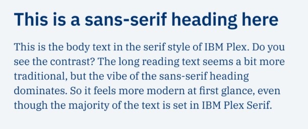
This combination suits most healthcare websites. It feels clean and modern.
You can pair a slightly heavier sans-serif for headings with a softer one for body text. This creates contrast without clutter.
This option works well for GP clinics, physiotherapy practices, and allied health providers.
Serif Heading + Sans-Serif Body

This pairing adds authority without harming readability. The serif heading signals expertise. The sans-serif body keeps reading easy.
Specialist clinics often benefit from this style, especially for long educational pages.
Single Typeface with Multiple Weights
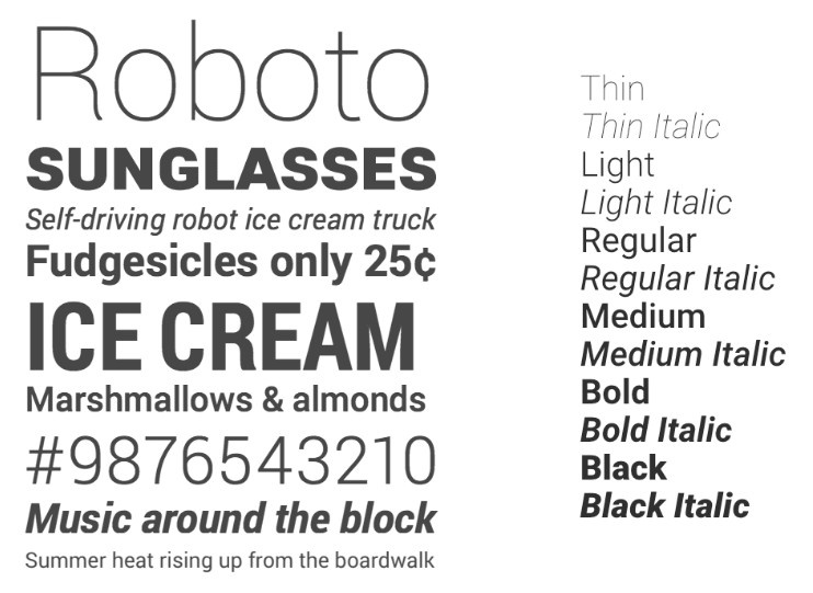
Using one font family with different weights keeps design simple. It reduces load times and improves consistency.
This approach suits minimalist healthcare websites focused on speed and clarity.
Variable Fonts for Modern Healthcare Sites
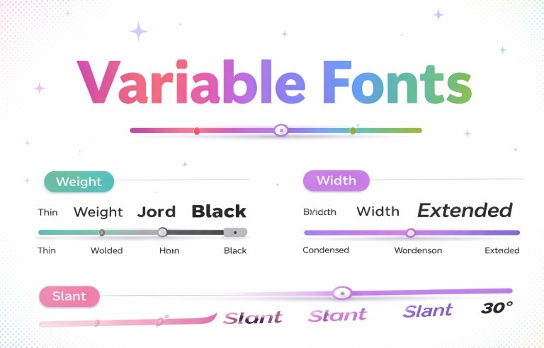
Variable fonts adjust weight and size dynamically. They support responsive layouts and reduce file requests.
When used correctly, they improve performance and readability across devices.
Font Pairing by Healthcare Website Type
GP and Family Practice Websites
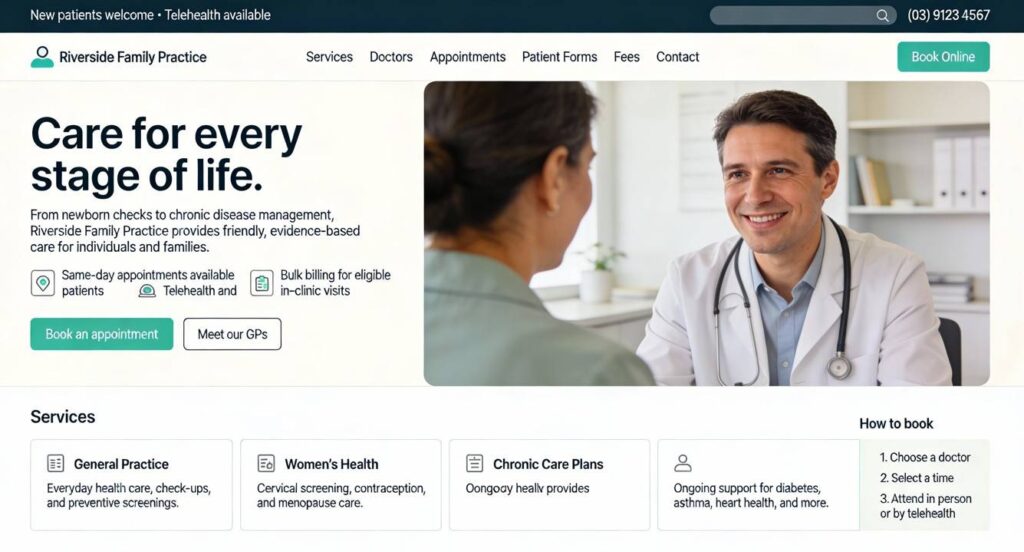
Family practices serve diverse age groups. Fonts should feel friendly and clear.
Sans-serif combinations with moderate spacing work well. Avoid fonts that feel clinical or rigid.
Specialist and Surgical Clinics

Specialist clinics benefit from structured typography. Serif headings paired with clean body text support authority.
Clear hierarchy matters for treatment explanations and long-form content.
Allied Health and Wellness Clinics

Wellness clinics need calm visual tone. Soft sans-serif fonts with rounded shapes support this feel.
Spacing and line height matter more than decoration.
Mental Health and Psychology Clinics

Mental health websites require gentle presentation. Fonts should reduce visual stress.
Avoid sharp contrast and tight spacing. Prioritise comfort and consistency.
SEO and Typography: How Fonts Affect Rankings Indirectly
Readability and Dwell Time
Readable typography keeps users engaged. Longer dwell time signals content relevance.
Search engines notice how users interact with your pages.
Typography and Core Web Vitals
Heavy font files slow load speed. Poor loading causes layout shifts.
Efficient font use supports performance and stability. This improves Core Web Vitals scores.
Typography and Semantic Content Structure
Clear headings help search engines understand page structure. Proper hierarchy supports topical relevance.
Typography supports how your content communicates meaning.
Best Practices for Implementing Fonts on Healthcare Websites
Limit the Number of Font Families
Two font families or one family with variations works best. More increases load time and visual noise.
Use Consistent Font Scales
Define sizes for headings, subheadings, and body text. Consistency improves comprehension.
Test Fonts Across Devices
Always test on mobile, tablet, and desktop. Some fonts look fine on desktop but fail on small screens.
Use System Fonts Where Appropriate
System fonts load faster and feel familiar. They work well for forms and long text.
Common Font Mistakes on Healthcare Websites
Many clinics use text that is too small. Others choose low contrast colours. Some mix too many fonts.
Inconsistent spacing, decorative headings, and tight line height reduce clarity.
Each mistake reduces patient confidence and engagement.
How to Choose the Right Font Combination for Your Clinic
Start with your patients. Consider age range, services, and reading needs.
Match font tone to your clinic type. Test readability before style.
Work with a healthcare-focused web team if needed. A professional healthcare web design company can guide font decisions that support patient trust and performance.
Conclusion: Fonts Are a Trust Signal in Healthcare Design
Fonts shape how patients experience your website. They influence comfort, understanding, and action.
Clear typography improves accessibility and engagement. It supports SEO by improving user behaviour. It helps patients feel confident before they book.
If your website struggles to convert or feels dated, typography may be the issue. At Pracxcel, we help healthcare clinics design websites that feel clear, professional, and patient-first. You can explore how we approach healthcare digital strategy at https://pracxcel.com.au/.


