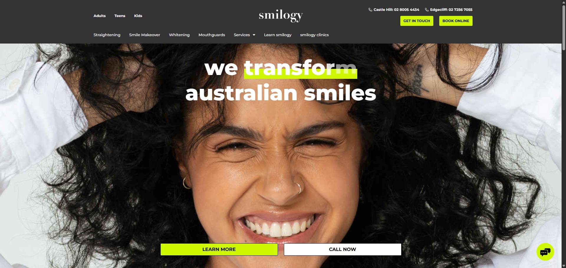
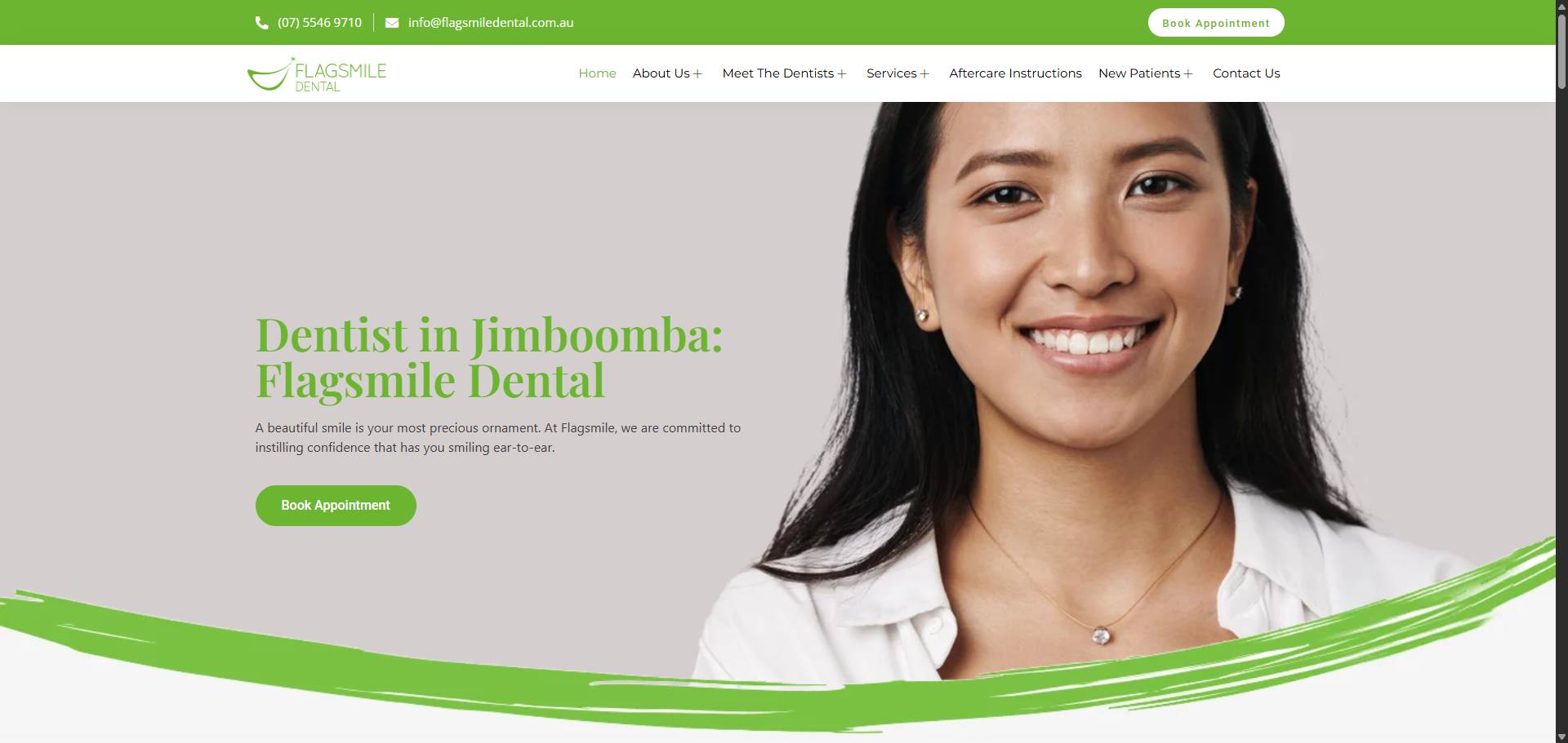
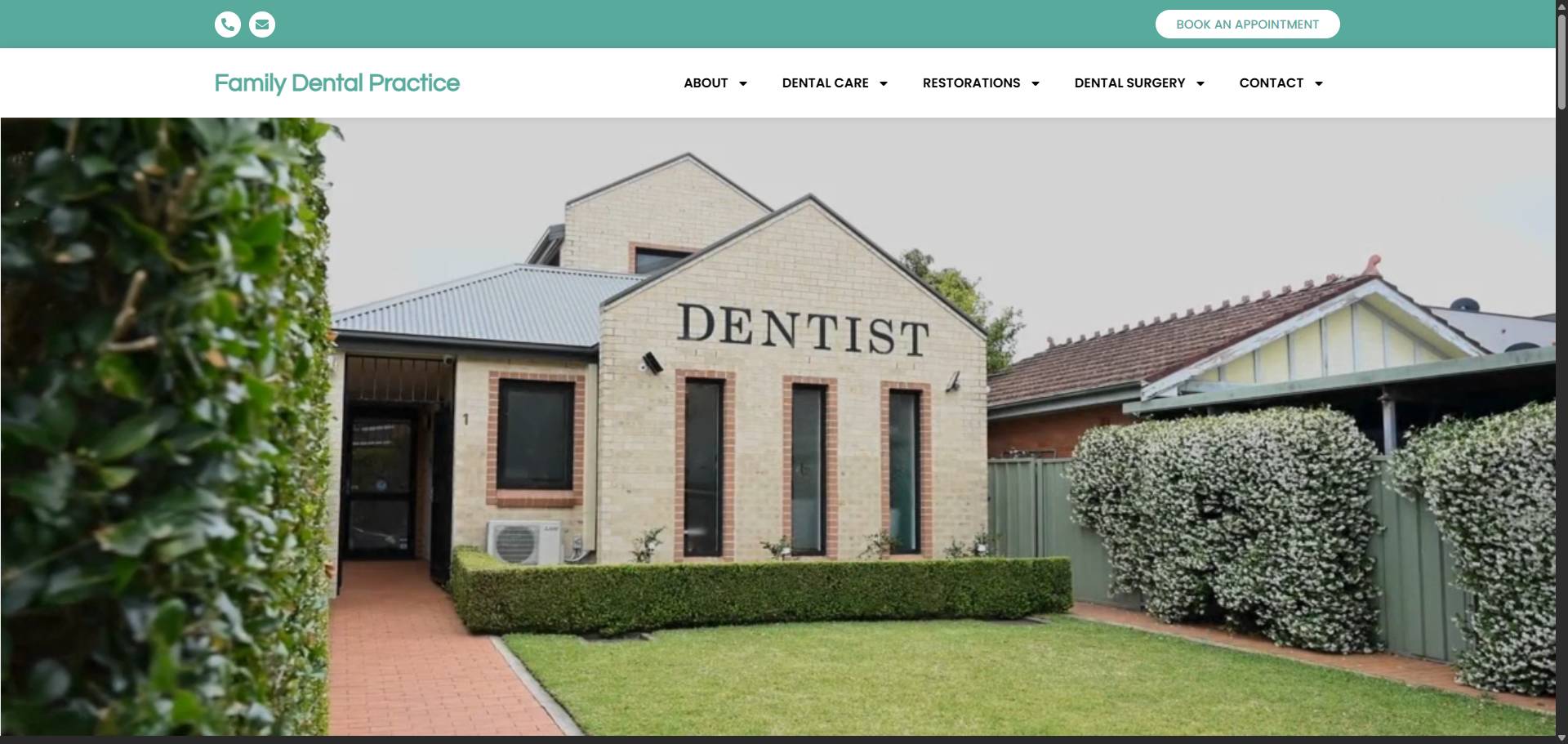
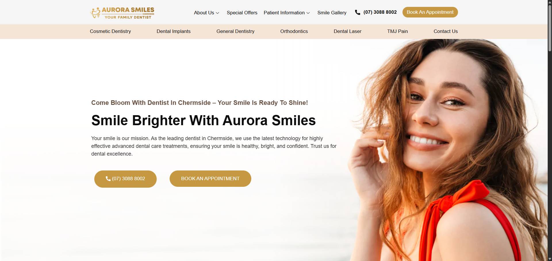
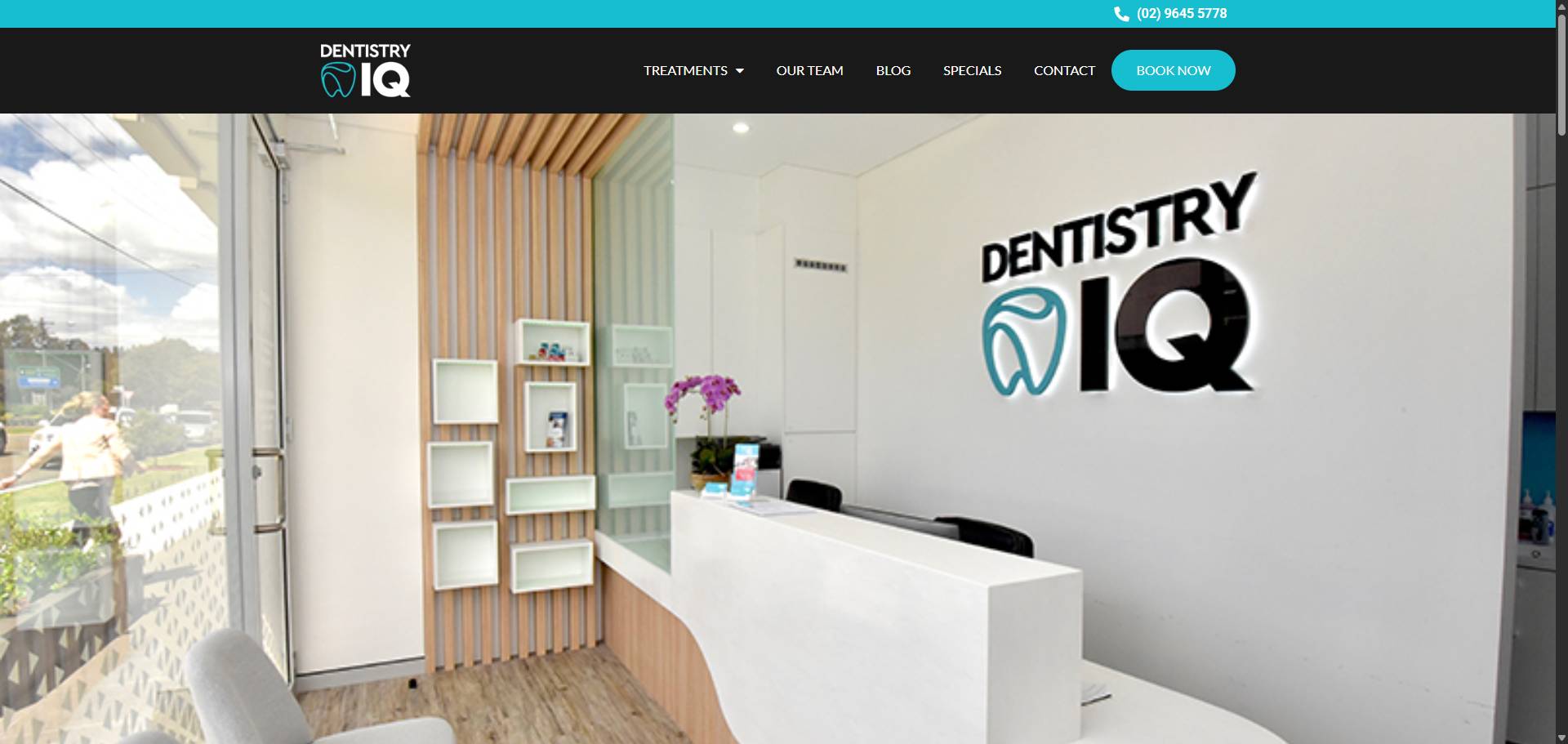
A well-crafted ‘Book Online’ button can transform your website from a browsing space into a booking machine. Its clarity, placement, design, and speed shape user decisions in crucial ways. This blog breaks down why this single element carries immense weight—from how mobile optimisation broadens access to persuasive text that nudges visitors to act. We also explore branding consistency and performance tracking, revealing how each piece fits together to maximise bookings. Understanding these factors helps turn clicks into customers with greater ease and confidence.
How a Clear ‘Book Online’ Button Simplifies Customer Decisions and Increases Bookings
A clear ‘Book Online’ button removes hesitation by offering a straightforward path to action. When customers spot an obvious, unambiguous call to book, they spend less time deciding and more time committing. This simplicity reduces friction, especially when paired with smart design choices from the section on making the button stand out. Clear labelling aligns with persuasive copywriting techniques that emphasise urgency or convenience without confusion. Placement also matters; a well-positioned button ensures it’s immediately visible, supporting quick decisions rather than letting potential clients scroll past in uncertainty. On mobile devices, clarity becomes even more crucial—tiny screens demand buttons that are easy to find and tap, linking closely to how mobile optimisation improves accessibility and bookings overall. A clean, consistent look around the button builds trust instantly so users feel confident clicking through without second-guessing their choice or site security. Clear calls-to-action shorten decision times while increasing conversion rates significantly across all user experiences.
The Impact of Button Placement on User Engagement and Conversion Rates
Button placement directly shapes how users interact with your website and can significantly affect conversion rates. Positioning the ‘Book Online’ button where visitors expect to find it removes friction and encourages immediate action. When the button sits prominently above the fold or near key information, users don’t have to search for it, cutting down hesitation. This clarity ties closely to how a clear button simplifies decisions, as discussed in another section. Poor placement, such as hiding the button in footers or crowded menus, risks lost bookings despite strong design or persuasive copywriting. Mobile optimisation also plays a role here; a well-placed button on smaller screens ensures easy access and taps, supporting better engagement across devices. Ultimately, consistent branding around the button’s location builds trust, while fast loading speeds prevent drop-offs before users even see it. Combining strategic placement with these elements creates a seamless path to booking that improves both user experience and your bottom line.
Design Elements That Make Your ‘Book Online’ Button Stand Out and Encourage Clicks
Design elements shape how your ‘Book Online’ button attracts attention and prompts action. Colour contrast is crucial; a button that clearly stands out against the page background draws the eye instantly. Shape and size matter too—buttons should be large enough to tap easily on mobile devices without overwhelming other content, linking closely to mobile optimisation considerations. Using subtle animations or hover effects can create visual cues that invite interaction without distracting users. Typography plays a role as well: clear, legible fonts paired with persuasive copywriting encourage clicks by communicating value succinctly. The button’s style must align with overall branding to maintain trust, tying into consistent branding efforts on your site. Finally, fast loading speeds ensure these design features appear immediately when visitors land on your page, preserving engagement from the start. Thoughtful design not only highlights the ‘Book Online’ button but also supports user decisions and enhances conversion rates through seamless integration with broader usability strategies covered elsewhere in this blog.
How Mobile Optimisation of Your ‘Book Online’ Button Enhances Accessibility and Captures More Bookings
Mobile optimisation of your ‘Book Online’ button ensures it is easy to find and use on smaller screens, removing barriers that often frustrate potential customers. When the button scales correctly and remains clearly visible without zooming or awkward scrolling, users can quickly take action, increasing booking rates. This ties closely with placement strategies—buttons positioned within thumb reach on mobile devices encourage more clicks. Alongside a clean design that stands out even on compact displays, mobile-friendly copy maintains clarity without crowding the interface. Fast loading speed becomes even more critical here; delays cause impatient users to abandon bookings before they start. Mobile optimisation also supports consistent branding across devices, reinforcing trust whether customers browse on a phone or desktop. Tracking mobile-specific performance helps refine these elements continuously, ensuring the ‘Book Online’ button converts visitors effectively no matter how they access your site. Without this focus, all other efforts in design or copy risk falling flat for an increasingly mobile audience.
The Role of Persuasive Copywriting in Driving Action Through Your ‘Book Online’ Button
Persuasive copywriting directly shapes how visitors respond to your ‘Book Online’ button by using clear, compelling language that motivates immediate action. Words that evoke urgency or highlight benefits make the choice feel simple and valuable, complementing the clarity addressed in the section on simplifying customer decisions. The copy must align with design elements discussed elsewhere; for example, concise text fits better within a standout button without overwhelming its visual appeal. Persuasive wording also works hand-in-hand with strategic placement—phrases like “Reserve Your Spot Now” placed where users naturally pause can increase engagement and conversions. On mobile devices, brief yet powerful copy ensures accessibility without clutter, reinforcing points made about mobile optimisation. Consistent tone around your branding builds trust, which supports repeat bookings as covered in related sections. Ultimately, persuasive copy is not just about what you say but how it guides users seamlessly from interest to booking through every interaction with your button’s presentation and performance metrics.
The Influence of Loading Speed on the Effectiveness of Your ‘Book Online’ Button
Loading speed directly shapes how effective your ‘Book Online’ button will be. Slow pages frustrate visitors, increasing the chance they’ll abandon your site before even seeing the booking option. A fast-loading button ensures users can act immediately once their decision is made, linking closely to placement and design elements that catch attention quickly. If your button appears instantly on a responsive, mobile-optimised page, it improves accessibility and keeps potential customers engaged rather than lost to delays. This swift access supports clear copywriting that prompts action without hesitation and reinforces consistent branding by delivering a smooth experience. Ultimately, loading speed underpins all other aspects of your booking interface’s success — if the page lags, even the most compelling wording or strategic positioning struggles to convert visitors into bookings. Monitoring performance metrics will highlight whether slow load times are undermining engagement and conversions over time.
How Consistent Branding Around Your ‘Book Online’ Button Builds Trust and Encourages Repeat Bookings
Consistent branding around your ‘Book Online’ button reassures visitors and builds a sense of reliability that encourages them to return. When colours, fonts and messaging align seamlessly with the rest of your site, it creates a familiar experience that feels professional and trustworthy. This cohesion reduces hesitation, making repeat bookings more likely because users recognise your brand instantly. Consistency also supports other key factors like design impact and persuasive copywriting, reinforcing the call to action without confusion. It complements clear button placement by creating a unified visual path that guides users naturally towards booking. On mobile, consistent branding ensures the button remains prominent and welcoming across devices, boosting accessibility and engagement. By maintaining this harmony, you strengthen the emotional connection with customers, turning a simple click into ongoing loyalty. This trust, combined with fast loading speeds and data-driven optimisation, makes your ‘Book Online’ button a powerful tool for sustained growth.
Measuring Success: Tracking and Analysing the Performance of Your ‘Book Online’ Button
Tracking how your ‘Book Online’ button performs reveals what truly motivates your visitors to act. Analysing click rates, user paths, and conversion patterns helps refine placement, design, and messaging for better results. When you understand these details, every element—from mobile accessibility to persuasive copy—works in harmony to guide customers smoothly towards booking. This insight turns assumptions into informed decisions that enhance trust and encourage return visits. With thoughtful attention to these factors, supported by tools like Pracxcel, your online booking experience becomes not just functional but genuinely inviting.


