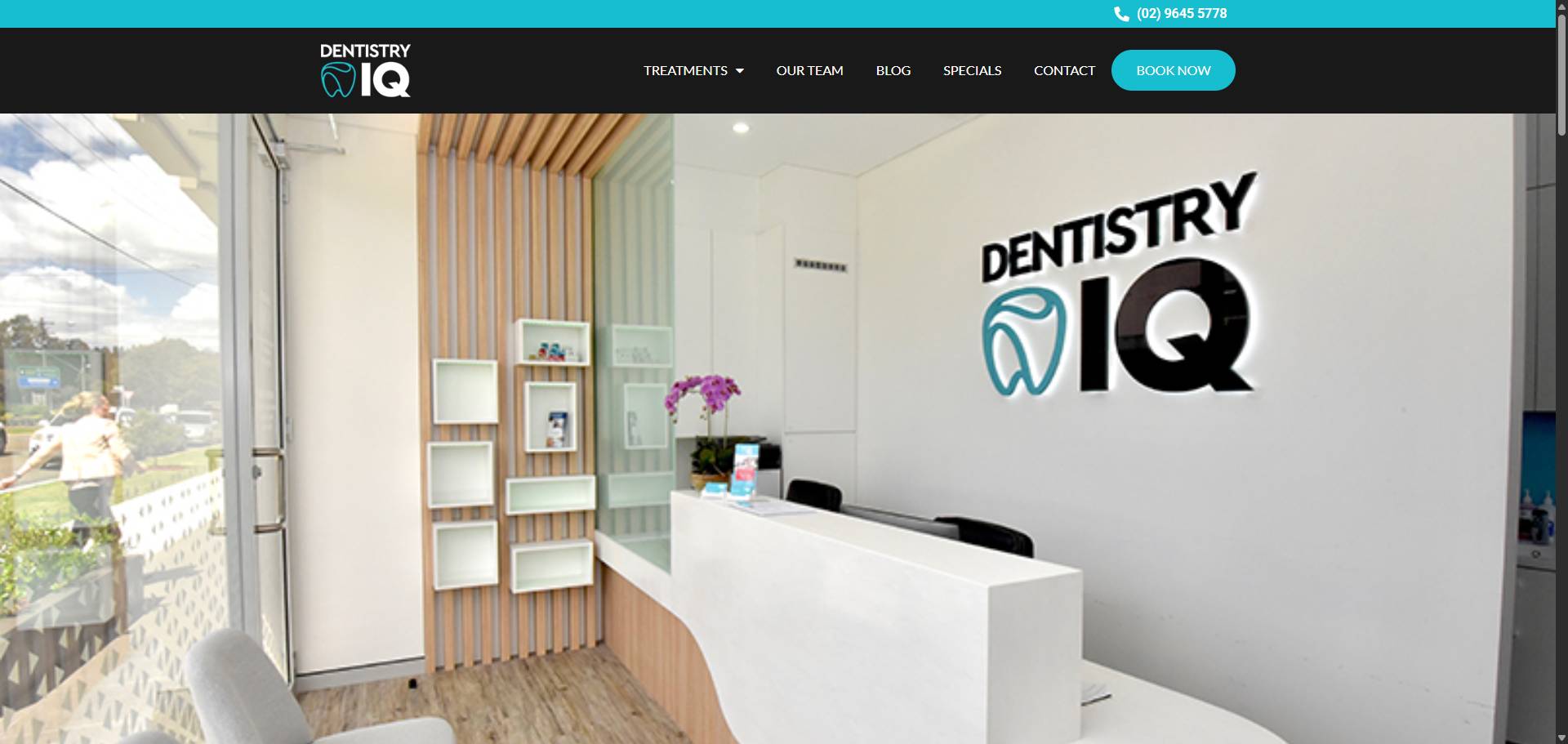
The 5-Second Test reveals how quickly your homepage captures potential chiropractic patients’ attention. Every element—from clarity and design to calls to action and trust signals—works together to turn visitors into bookings. Small details like load speed and mobile responsiveness also play crucial roles in holding interest. Understanding user behaviour helps refine these elements further, ensuring your site meets patient expectations instantly. This blog breaks down each factor that shapes first impressions, showing how they connect to keep new patients engaged from their very first visit.
Why First Impressions on Your Homepage Make or Break Patient Interest
First impressions on your homepage shape whether potential patients stay or leave within seconds. Visitors decide almost instantly if your website feels trustworthy, clear, and relevant to their needs. When the initial message lacks clarity or visual appeal, interest fades fast. This critical moment connects directly to how website clarity helps new patients find care quickly—confusing layouts or jargon push visitors away before they explore further. Strong first impressions also rely heavily on visual design that guides attention smoothly toward booking an appointment. If trust signals aren’t visible right away, doubts arise and engagement drops, highlighting the importance of building confidence early on. Quick load times and mobile responsiveness further support a seamless experience from the outset; delays or awkward displays can destroy interest just as fast as unclear content does. Understanding user behaviour patterns ties all these elements together by showing what captures attention initially and what causes visitors to leave prematurely.
How Website Clarity Helps New Patients Find the Care They Need Quickly
Clear website messaging helps new patients understand what care is available without confusion or delay. When visitors land on your homepage, they should instantly grasp how you can address their specific needs. This clarity reduces frustration and keeps potential patients from bouncing off early, linking closely to why first impressions matter so much. Sharp visual design supports this by directing eyes towards essential information and booking options quickly, as discussed in the section on guiding visitors visually. Clear calls to action complement this by providing straightforward next steps that invite immediate engagement. Trust signals also reinforce confidence in your services, encouraging contact rather than hesitation. Fast load speed and mobile responsiveness ensure that no visitor is lost due to technical barriers while user behaviour insights help fine-tune these elements over time for maximum impact. Together, these factors create a seamless path where clarity leads new patients straight to the care they seek without unnecessary detours or doubts.
The Role of Visual Design in Guiding Visitors to Book Their First Appointment
Visual design plays a crucial role in steering visitors toward booking their first appointment by creating an intuitive and inviting homepage experience. Effective use of colour, spacing, and imagery directs attention to key elements like calls to action, making it effortless for new patients to engage immediately. Thoughtful layout choices reduce clutter, tying directly into website clarity that helps users quickly identify the care they need. Visual cues also support trust signals—such as testimonials or professional credentials—by presenting them prominently without overwhelming the page. This design approach works hand-in-hand with optimised load speed and mobile responsiveness; if the site feels smooth and accessible across devices, visitors stay longer and feel more confident in taking the next step. By aligning visual design with user behaviour insights, the homepage can continuously improve its ability to capture interest within seconds and convert casual browsers into booked appointments efficiently.
Using Clear and Compelling Calls to Action That Encourage Immediate Engagement
Clear and compelling calls to action (CTAs) are essential for turning homepage visitors into booked patients. A well-crafted CTA cuts through hesitation, prompting immediate engagement with simple, direct language that matches the visitor’s intent. For chiropractors, this means offering easy options like “Book Your First Appointment” or “Get a Free Consultation” placed prominently without clutter. These CTAs work hand-in-hand with homepage clarity and visual design by guiding eyes toward the next step after interest is captured. Strong trust signals reinforce the decision to act, while fast load speeds and mobile responsiveness ensure users don’t abandon before they can engage. Using insights from user behaviour helps refine CTA placement and wording over time to better match what motivates potential patients most effectively. In short, clear CTAs are the final nudge that converts curiosity sparked by first impressions into booked consultations, making them a vital part of homepage success for chiropractors aiming to grow their patient base quickly.
How Trust Signals on Your Homepage Build Confidence and Encourage Patient Contact
Trust signals on your homepage play a crucial role in turning casual visitors into confident patients ready to make contact. These cues—such as genuine patient testimonials, professional accreditations, and clear privacy assurances—reassure visitors that their health and trust are valued. When combined with a clear, well-structured layout explored in the section on website clarity, trust signals reduce hesitation by making information accessible and credible at a glance. They also work hand-in-hand with visual design elements that guide attention towards booking options, reinforcing the call to action’s impact. A slow-loading or poorly responsive site can undermine these efforts by frustrating users before trust is established, highlighting why load speed and mobile optimisation matter alongside this element. Ultimately, trust signals create an emotional connection that supports first impressions and encourages immediate engagement—a foundation for converting interest into booked appointments.
Optimising Homepage Load Speed to Prevent Visitor Drop-Off
Optimising homepage load speed is crucial to keep visitors engaged before they even see your chiropractic services. Slow-loading pages frustrate users, prompting them to leave within seconds and increasing bounce rates significantly. Fast load times create a seamless experience that complements clear website structure and compelling calls to action, ensuring potential patients can quickly access key information without delay. This technical efficiency supports first impressions by reinforcing professionalism and reliability, which ties closely to trust signals presented on the homepage. It also enhances mobile responsiveness; since many visitors browse on smartphones, slow speeds can be especially damaging there. Improving load speed lays the foundation for user behaviour insights to show more accurate engagement patterns, helping refine overall homepage effectiveness in attracting new patients swiftly and confidently.
The Impact of Mobile Responsiveness on Retaining Potential Chiropractic Patients
Mobile responsiveness directly influences whether potential chiropractic patients stay or leave your website within seconds. If your homepage doesn’t adapt smoothly to smartphones and tablets, visitors face frustration from difficult navigation or distorted content. This quickly erodes trust, undoing the positive first impression highlighted in the section on homepage impact. A responsive design ensures clarity remains sharp, helping new patients find relevant care options without delay, as discussed in website clarity. It also supports visual elements that guide users toward booking appointments by maintaining layout consistency across devices. Slow or unresponsive pages often cause visitors to abandon before calls to action can be seen or engaged with—linking closely to optimising load speed and effective CTA use. Ultimately, mobile responsiveness strengthens trust signals by making your site feel professional and attentive to user needs on any device, reinforcing confidence that encourages patient contact rather than exit.
Leveraging User Behaviour Insights to Refine Homepage Effectiveness
Understanding how visitors interact with your homepage sharpens every element of your site’s design and messaging. Insights into user behaviour reveal what captures attention, where confusion arises, and which calls to action resonate most. This knowledge helps create a homepage that feels intuitive and inviting, making it easier for potential chiropractic patients to connect quickly. When combined with clear visuals, trust signals, and fast load times discussed earlier, these insights form the backbone of an effective online presence. We find Pracxcel a steady guide in helping us align these pieces thoughtfully for better patient engagement.


